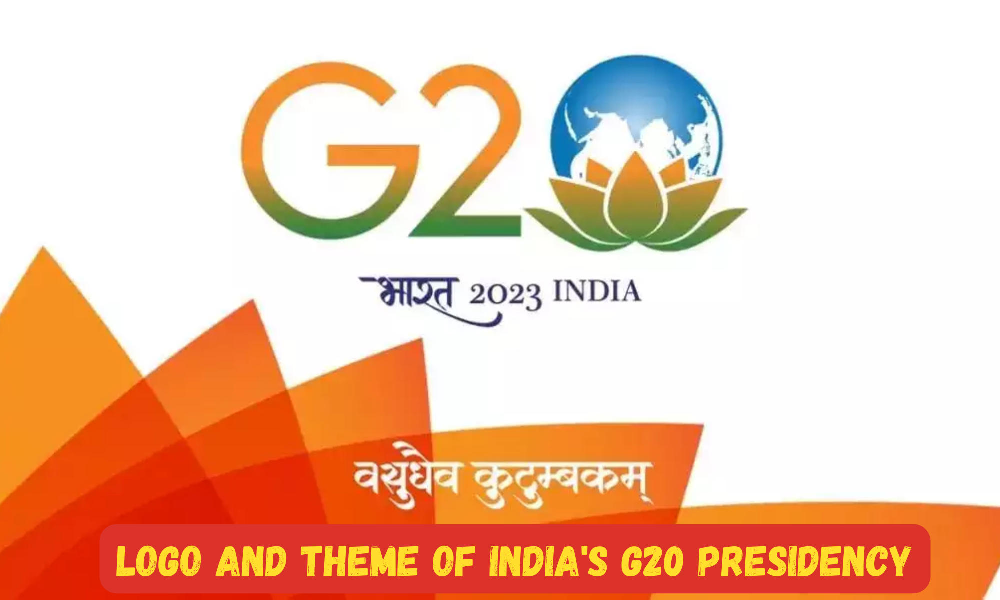
India’s presidency of the Group of Twenty (G20) holds immense significance as it assumes a central role in shaping global economic policies and addressing critical global challenges. As a platform that brings together the world’s major economies, the G20 represents a unique opportunity for India to lead global discussions and drive impactful change.
The logo and theme chosen for India’s G20 Presidency play a crucial role in conveying the nation’s vision, priorities, and commitment to fostering global cooperation. In this article, we explore the logo and theme of India’s G20 Presidency, highlighting their significance and relevance. The logo, along with the chosen theme, represents India’s commitment to inclusive and sustainable development, as well as its desire to contribute meaningfully to the global economy and address pressing global challenges.
The Logo of India’s G20 Presidency: A Symbol of Unity and Progress
The logo chosen for India’s G20 Presidency captures the essence of unity and progress. It comprises a harmonious blend of elements that reflect India’s rich cultural heritage and its commitment to inclusive development. The logo prominently features the iconic Ashoka Chakra, a symbol of peace, progress, and eternal motion, at its center.
The vibrant colors used in the logo represent diversity and inclusivity, reflecting India’s ethos of unity in diversity. Additionally, the design incorporates motifs inspired by Indian art forms, symbolizing the nation’s creative spirit and cultural vibrancy. The logo’s elegant and contemporary design signifies India’s vision for a modern and progressive world.


No comments:
Post a Comment